Summer Color Palette Ideas to Brighten Your Home in 2026

Summer is the season of warmth, light, and fresh energy, and your home should reflect that feeling. The right summer color palette can completely change the atmosphere of a space, making it feel brighter, calmer, and more inviting without requiring a full renovation.
In 2026, summer home color trends are moving toward airy blues, warm earthy tones, soft peaches, creamy neutrals, and nature-inspired greens. These shades help create interiors that feel peaceful during hot weather while still looking stylish and modern.
Whether you love coastal calm, modern minimalism, tropical energy, or soft romantic spaces, this guide covers the best summer color palette ideas, how to use them, and easy ways to refresh your home for the season.
1. Why Summer Color Palettes Matter in Home Design
Colors affect the way a room feels emotionally and visually. During summer, heavy dark shades can make interiors feel warmer and smaller, while light reflective tones create openness and freshness.
Summer palettes are designed to:
- make rooms feel airy
- reflect natural sunlight beautifully
- create calm and comfort
- bring nature indoors
- add seasonal energy without overwhelming the space
The best summer interiors feel effortless, soft, and relaxing.
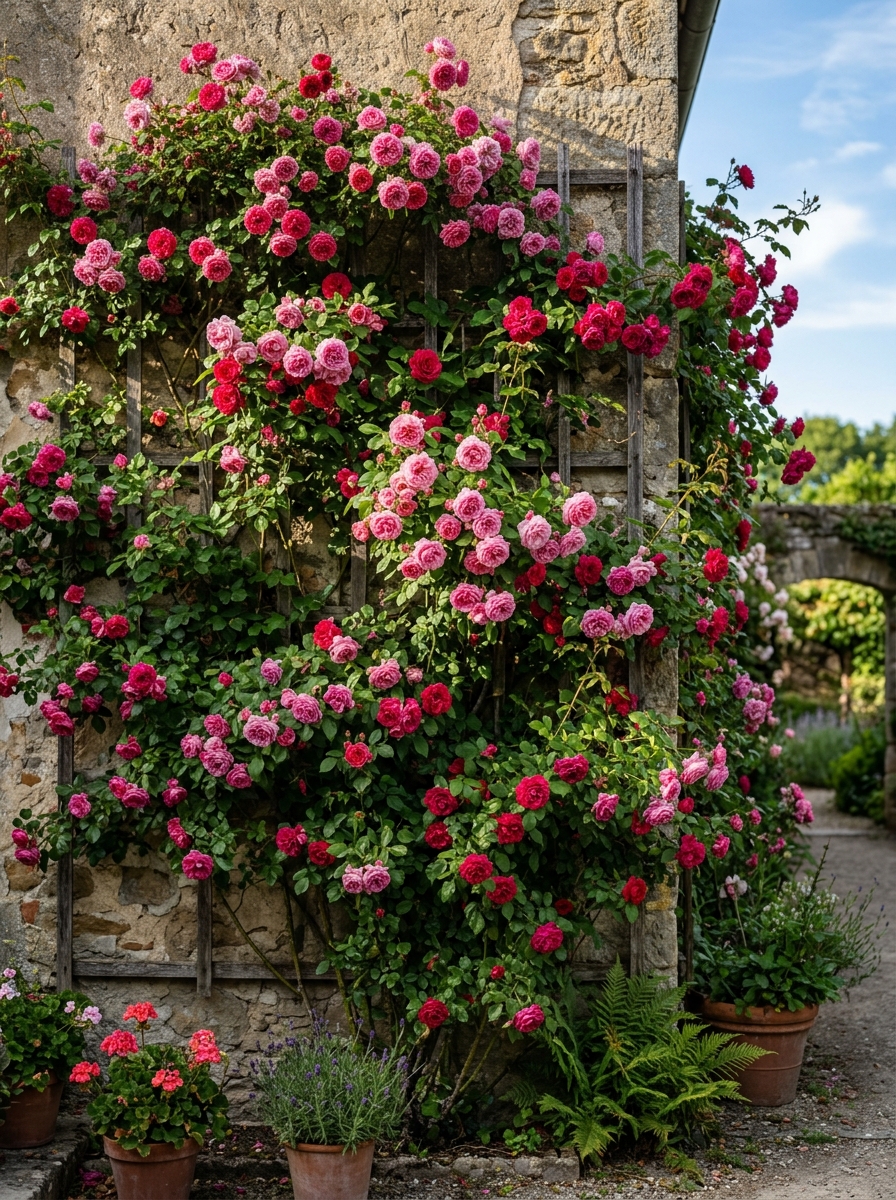
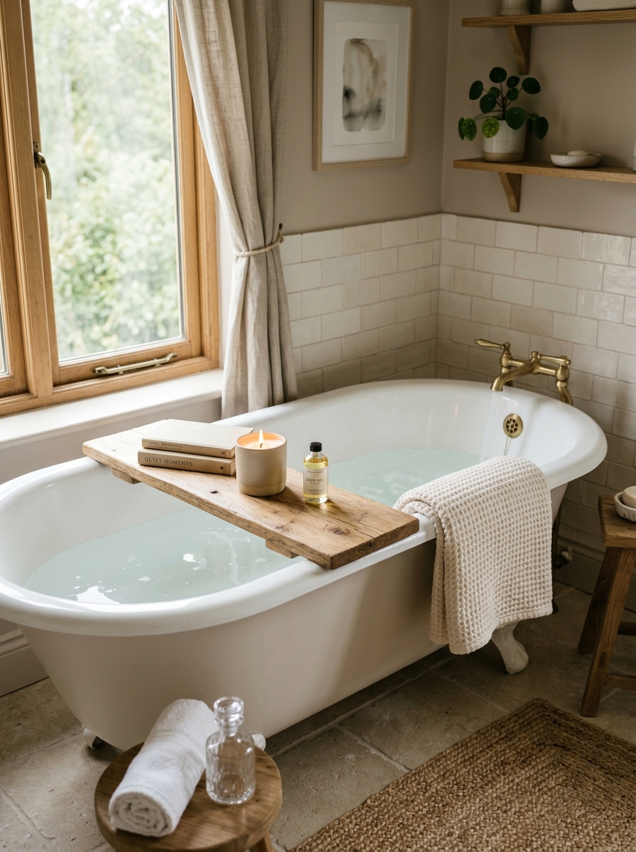
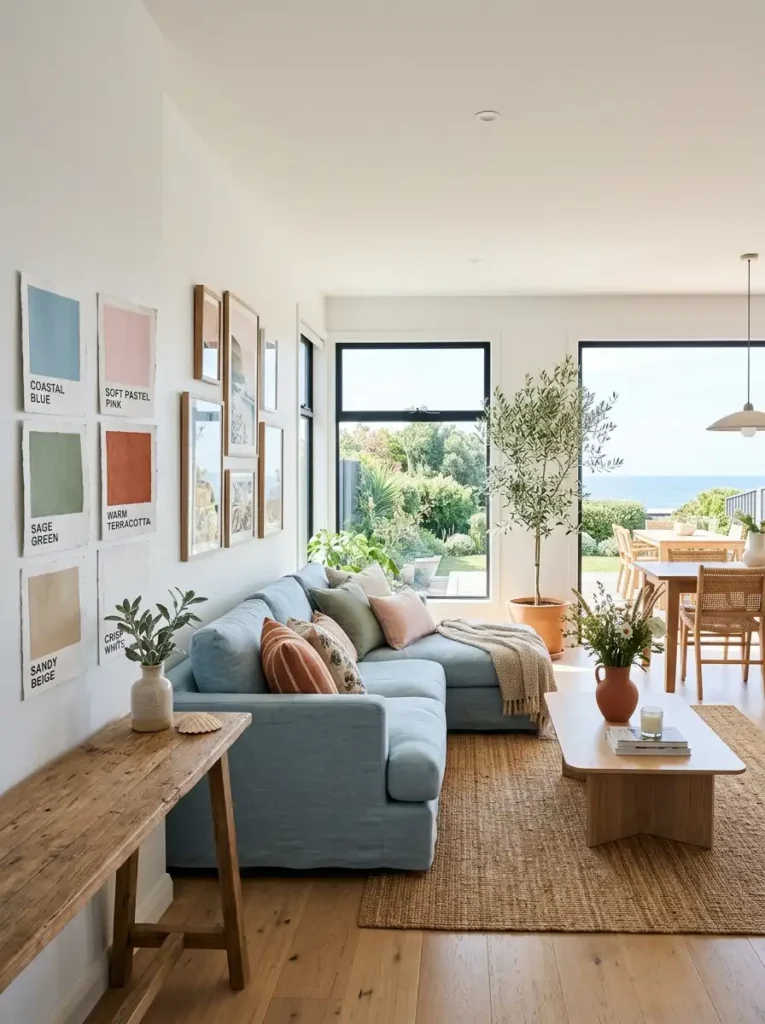
2. Coastal Calm: The Most Popular Summer Palette
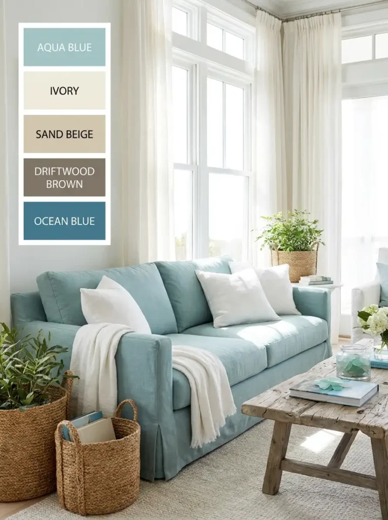
One of the biggest summer color trends for 2026 is the coastal-inspired palette.
This style uses:
- sky blue
- aqua
- ivory
- sandy beige
- soft white
These colors mimic beaches, ocean skies, and natural coastal textures. Together they create a peaceful environment that instantly feels cooler and more open.
This palette works beautifully in:
- bedrooms
- living rooms
- bathrooms
- sunrooms
Natural materials like rattan, linen, driftwood, and woven baskets pair perfectly with coastal colors.
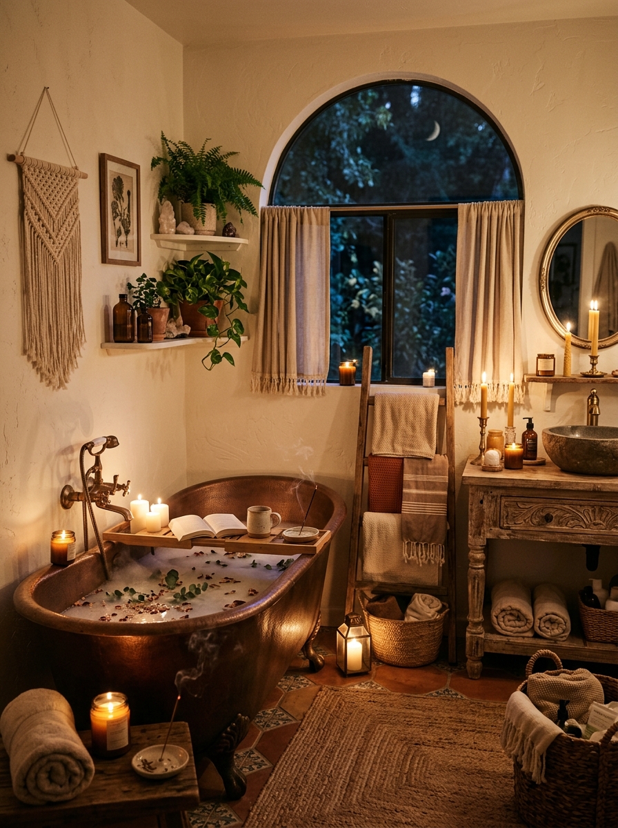
3. Warm Sunshine Tones for a Cheerful Home
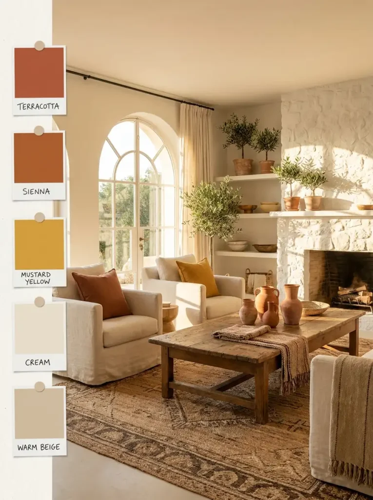
Not every summer palette needs to feel cool. Warm earthy colors inspired by sunlight are becoming increasingly popular.
Trending shades include:
- terracotta
- sienna
- mustard yellow
- burnt orange
- golden beige
These tones create warmth while still feeling seasonal and natural.
Terracotta especially adds a Mediterranean summer feeling that works beautifully with wooden furniture and neutral walls.
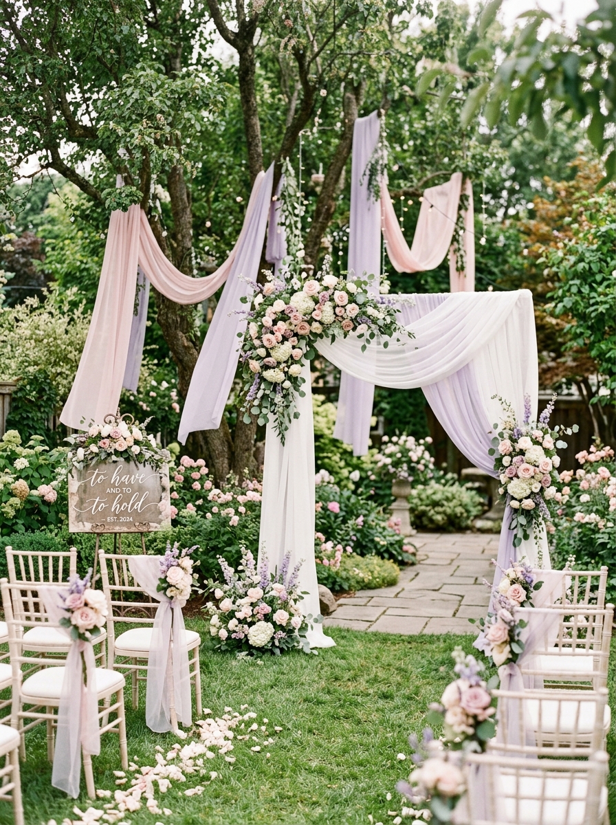
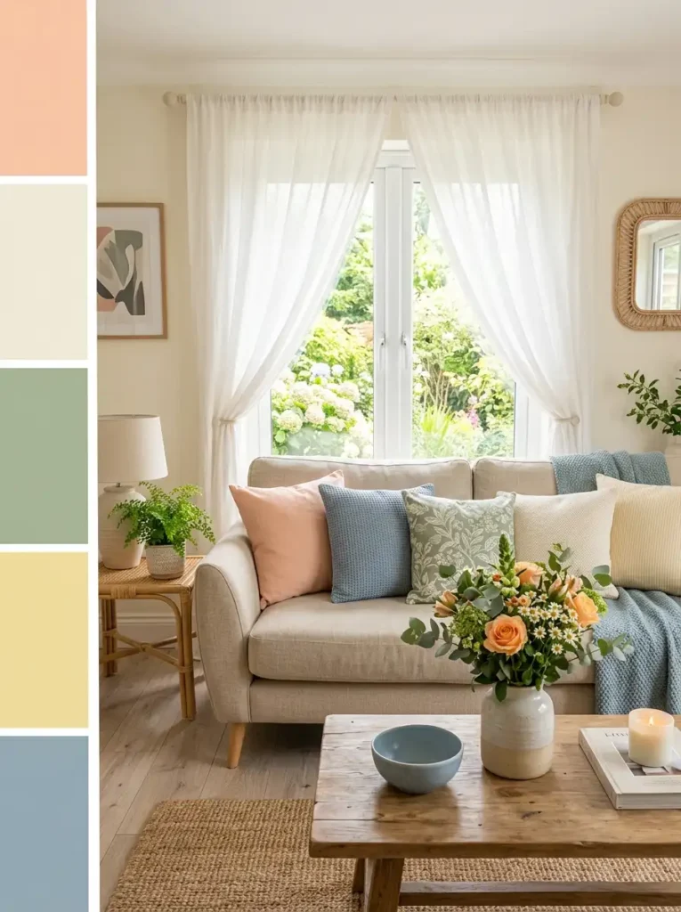
4. Soft Pastels Create a Calm Modern Look
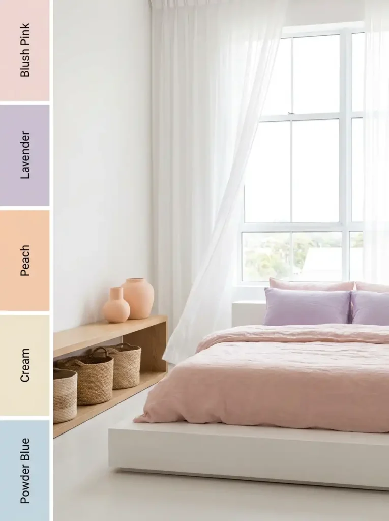
Soft pastel palettes continue to dominate modern summer interiors because they feel gentle and emotionally comforting.
Popular pastel shades include:
- blush pink
- lavender
- soft peach
- powder blue
- creamy mint
Pastels work especially well in small rooms because they brighten spaces without looking harsh.
The key is balance. Pair soft colors with white walls, natural fabrics, and subtle textures for a clean modern look.
5. Natural Greens Bring the Outdoors Inside
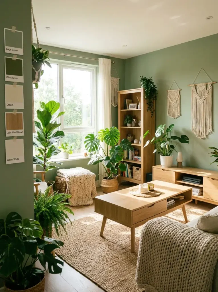
Green shades remain timeless for summer interiors because they instantly create freshness.
Trending summer greens include:
- sage green
- olive green
- eucalyptus
- light moss tones
Green pairs beautifully with:
- light wood
- cream furniture
- woven decor
- indoor plants
This combination creates a relaxed organic atmosphere inspired by nature.
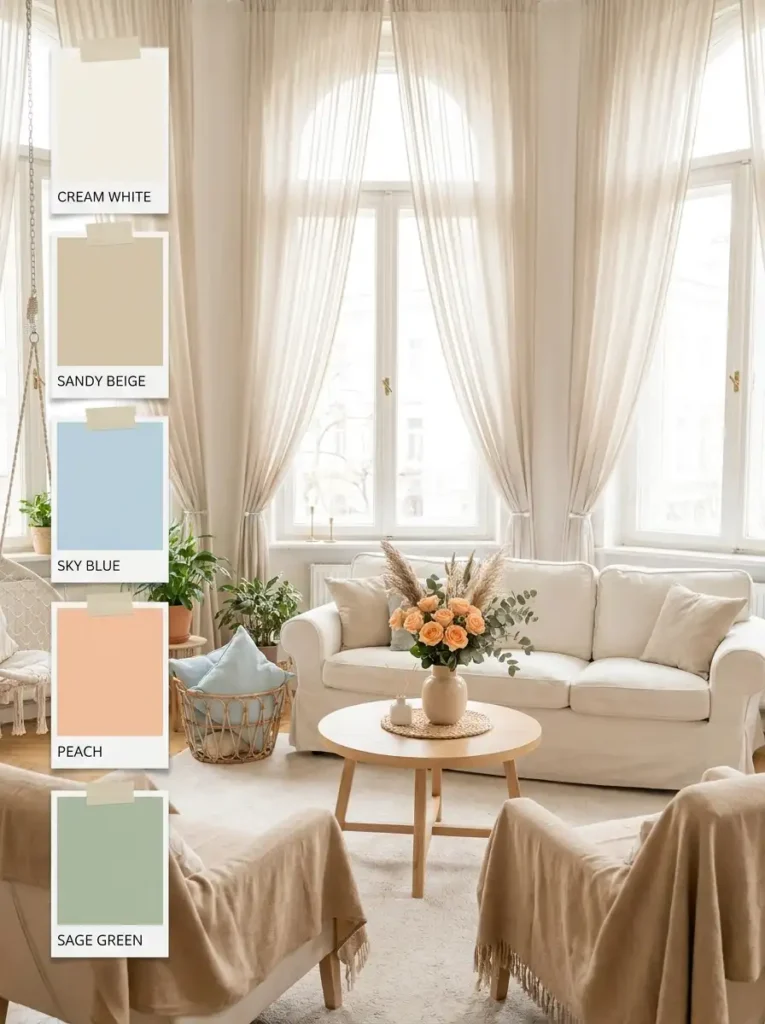
6. Peach Fuzz: The Trending Summer Shade of 2026
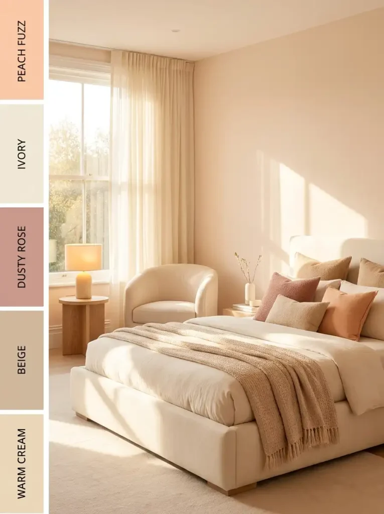
Peach Fuzz continues influencing home decor trends because of its warm, soft, and comforting appearance.
This muted peach shade:
- adds warmth without overpowering
- works with both modern and vintage decor
- pairs beautifully with cream and beige
- creates a soft glowing atmosphere
Peach tones are especially beautiful in:
- bedrooms
- reading corners
- entryways
- dining spaces
7. Bone China Blue Creates Instant Calm
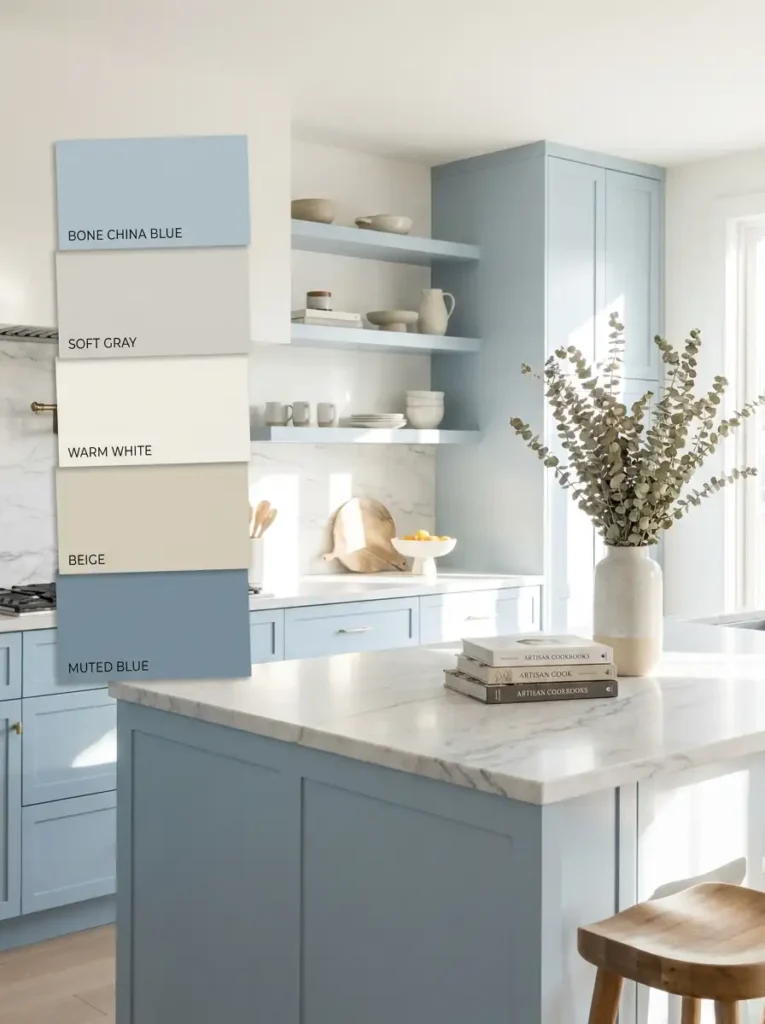
Bone China Blue is another major summer trend. Inspired by clear skies and calm water, this soft muted blue helps interiors feel peaceful and spacious.
This color works beautifully for:
- painted walls
- accent chairs
- curtains
- ceramic decor
- kitchen cabinets
Pair it with warm neutrals to avoid a cold atmosphere.
8. The 60-30-10 Rule for Perfect Color Balance
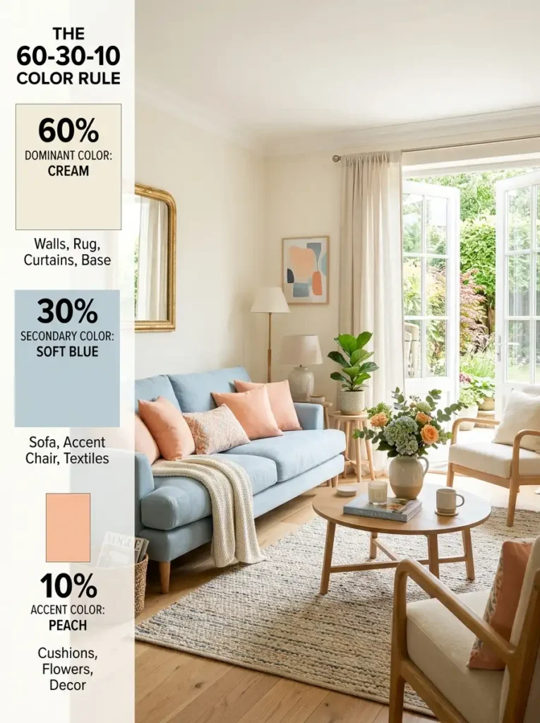
One reason some colorful spaces feel overwhelming is poor balance.
The 60-30-10 rule helps create harmony:
- 60% dominant neutral color
- 30% secondary supporting color
- 10% accent color
Example:
- white walls
- soft blue sofa
- peach cushions and decor accents
This method keeps interiors balanced and visually calming.
9. Easy Summer Refresh Ideas Without Renovating
You do not need to repaint your entire home to create a summer atmosphere.
Simple seasonal updates include:
- switching heavy curtains for linen
- adding pastel cushions
- changing artwork
- styling fresh flowers
- using lightweight cotton throws
- replacing dark decor with lighter accessories
Small changes often make the biggest difference.
10. Best Summer Color Palettes for Living Rooms
Living rooms benefit most from refreshing summer palettes because they are often the brightest spaces in the home.
Popular combinations include:
- ivory and sage
- dusty blue and cream
- peach and beige
- terracotta and white
- lavender and soft gray
The goal is creating a space that feels bright yet comfortable.
11. Tropical Summer Color Palette Ideas
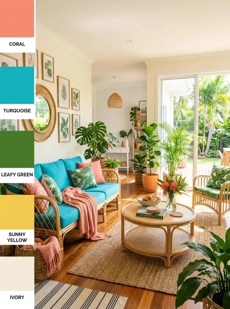
For people who love vibrant interiors, tropical palettes add playful summer energy.
These palettes include:
- coral
- turquoise
- sunny yellow
- leafy green
- tropical pink
The trick is moderation. Use tropical colors through smaller accents instead of overwhelming entire rooms.
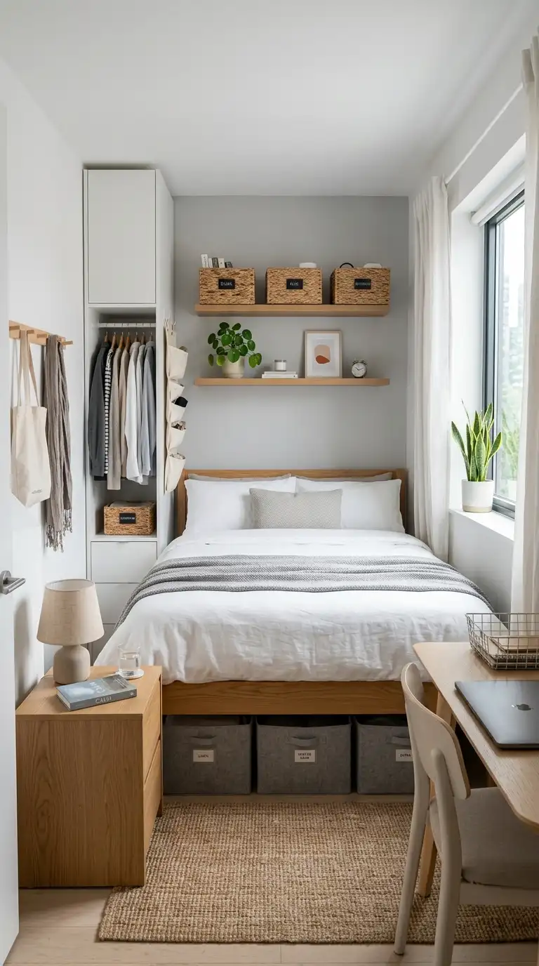
12. Summer Color Palette Ideas for Bedrooms
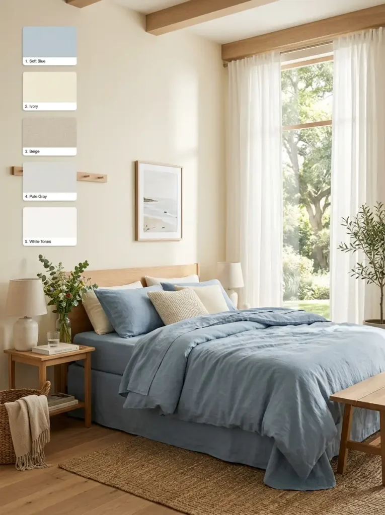
Bedrooms should feel restful during hot weather.
The best summer bedroom palettes include:
- soft blue and white
- lavender and cream
- sage and beige
- peach and ivory
Layer lightweight fabrics with soft natural lighting for the most relaxing effect.
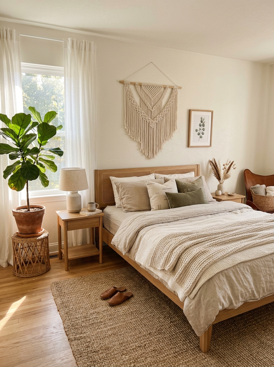
13. Summer Decor Trends Inspired by Nature
Nature-inspired interiors continue growing in popularity because they create emotional comfort.
Key natural elements include:
- woven baskets
- rattan furniture
- linen fabrics
- indoor olive trees
- floral prints
- light oak wood
Combined with summer colors, these materials create timeless seasonal interiors.
14. How to Choose the Right Summer Palette for Your Home
Before selecting colors, consider:
- room size
- natural lighting
- furniture tone
- desired mood
- existing decor
Bright rooms can handle warmer shades, while darker spaces often benefit from cooler airy colors.
The best palette is one that feels calming and natural in your daily life.
Final Thoughts
Summer color palettes are about creating spaces that feel lighter, calmer, and emotionally refreshing. Whether you prefer coastal blues, earthy terracotta, soft pastels, or natural greens, the right colors can completely transform the atmosphere of your home.
Instead of chasing short-term trends, focus on shades that make your space feel peaceful, welcoming, and connected to nature. Even small seasonal updates through textiles, plants, and accessories can make your home feel beautifully refreshed for summer 2026.
FAQs
What is the best summer color palette for home interiors?
Soft blues, sandy beige, sage green, peach, and creamy white are among the best summer colors because they create an airy and calming atmosphere.
What colors make a room feel cooler in summer?
Cool tones like sky blue, aqua, lavender, soft gray, and sage green visually make rooms feel fresher and more spacious.
What is the trending summer color palette for 2026?
Popular 2026 summer palettes include Peach Fuzz, Bone China Blue, terracotta neutrals, soft pastels, and coastal-inspired color combinations.
How can I decorate my home for summer without repainting?
You can refresh your home by adding pastel cushions, lightweight curtains, plants, summer artwork, and lighter fabrics like linen or cotton.
What is the 60-30-10 color rule?
It is a decorating method where 60% of the room uses a dominant color, 30% uses a secondary color, and 10% is used for accent colors.
Are tropical summer palettes still trendy?
Yes, tropical palettes using coral, turquoise, green, and yellow remain popular when used in moderation through accessories and decor accents.

")
")